
3 months ago I wrote that all ads on Life Coaches Blog were off, due to a new contract at work that stated I had to share part of my profits with the company if I were to do outside work.
That was all fine and good, but if I was to be honest with myself, the ability to make some extra cash from Life Coaches Blog was a big motivator for me to keep this site running. And not only that, the monthly Adsense cheques were a great way to measure progress – the better I was running Life Coaches Blog, the more money I’d get. All that went out the window the day I switched the ads off.
The solution came when I was writing in my journal (a great way to clear your head and beat the blues). I wasn’t even thinking about Life Coaches Blog, but how I could contribute more to the causes that matter to me.
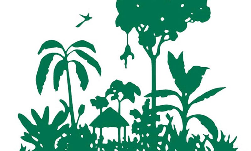
Life Coaches Blog used to be one of the ways I’d contribute, as I’d dedicated 20% of all my profits previously to Conservation International, a group that helps protect the environment and has a 4-star rating from Charity Navigator. And then I started to think, since I couldn’t make profits on Life Coaches Blog for myself, what if I donated 100% of all its profits to CI?
So that’s what I’ve decided to do. From today on, you’ll see that the ads are back, but I’m not going to make a single cent personally from them. All the profits are going straight to Conservation International, and I’m even going to foot the bill for the domain from my own pocket. I’m going to keep Conservation International’s receipts and Adsense’s mailings, so anyone who wants to see proof of donations need only ask.
That’s the new mission.